

UX Case Study · Mobile Game · Undergraduate Capstone 2025
ScottyU
A mobile game that turns the chaos of freshman year at CMU into a quest you actually want to play.


my role
Product Manager
timeline
15-wk capstone · Spring 2025
client
Dietrich College, CMU
HCI Capstone Team —
Emily Amspoker
Shirley Du
Connie Kim
Janelle Tecson
Tian Zhou


The results
Top 2
of all HCI Capstone projects — selected to present at the 2025 CMU Undergraduate HCI Commencement.
87%
of playtest participants expressed strong interest in continued use.



See it in action
The core loop: quests, skills, badges, and the tutorial that ties it all together. Screens below are ready for gameplay captures.

Maps & Journey

Skills

Badge System

Quests

Faculty Cards


Research
the problem
Incoming CMU first-years often struggle to adapt to a rigorous, high-pressure environment that contrasts sharply with their prior academic success.
our goal
Design a playful mobile experience that empowers students to confidently navigate their first year and build a strong foundation for success.
our solution
A high-fidelity mobile game with an interactive tutorial that guides students through the app’s skill-building features.

Our FYS journey map — actions, emotions, and pain points across a first-year’s timeline, from Orientation Week to end of Freshman Year.

what students told us — insight → feature it inspired
A Sense of Belonging → Quests
Engagement with Resources → Badges
Agency → Skills & Faculty Cards
Clear Journey Through First Year → Timeline
Mentorship in College → Advice XP Boost

how might we
…create an engaging, supportive experience — socially and technically — that helps first-year students find their footing at CMU?
Social lens
— Simulate real-world social interactions in a low-pressure setting
— Integrate mentorship features for peer guidance
— Use storytelling & role-play to foster belonging, self-discovery, and agency
Technical lens
— Implement habit-tracking & progress-based mechanics
— Ensure intuitive UI/UX for easy navigation
— Design pseudo-multiplayer & collaborative features to promote cross-college connections

Design process
1. Ideation & lo-fi prototyping
We ran Crazy 8’s, prioritized features against research, and whiteboarded flows — then narrowed scope with the client and got sign-off on the app’s core structure.
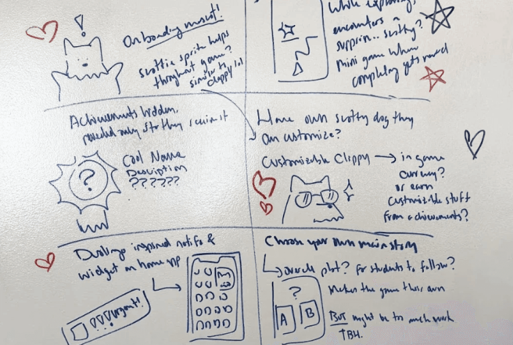
Crazy 8’s Brainstorming

Feature Prioritization
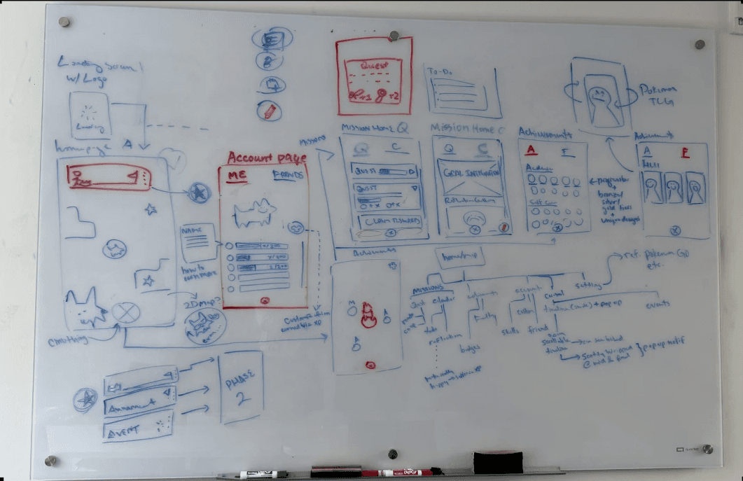
Whiteboard Prototyping
2. Structuring the information architecture
From our whiteboard flows, we mapped every feature into a single nav structure — then split ownership across the team to build it out.
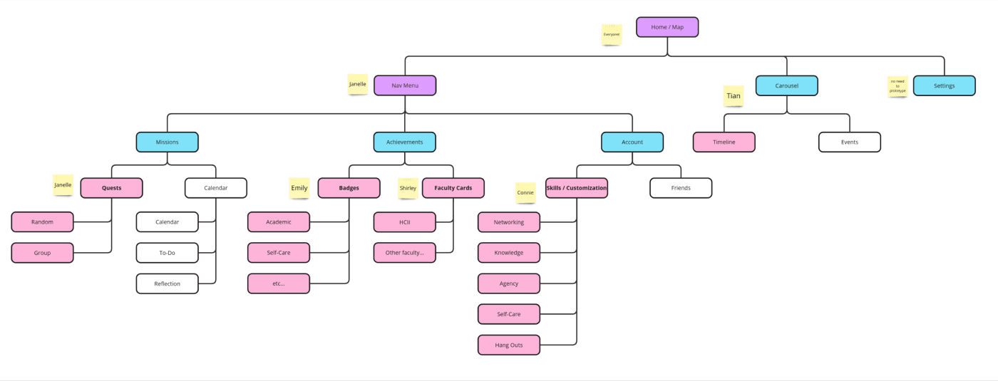
3. Mid-fi → hi-fi iterations
Usability testing with 8 participants (1 first-year, 4 upperclassmen, 2 game designers, 1 UX designer) surfaced confusion we designed our way out of:

Affinity diagram of usability insights

Navigation menu
Before: unclear labels made Quests and Faculty Cards hard to find.
After: renamed items, regrouped pages, added an icon to every entry.

Map & timeline
Before: the timeline read like an achievements tracker, not a schedule.
After: added red dots signifying dedicated page for upcoming events.

Quests
Before: quest reminders only visible in its page.
After: implemented quest alert and description with the map page.

Badges
Before: pin/unpin and tier colors confused testers.
After: simplified the widget and surfaced reward details (EXP, coins) .
4. Designing the tutorial
Post-playtest feedback was consistent: first-time users needed clearer onboarding, and clearer connections between features. We answered with a dedicated tutorial system.

Initial Ideation

User Flow

Low-fi Wireframing
where we landed
A hi-fi prototype with working features, a coded tutorial flow, and full research documentation ready for hand-off.
what’s next
Code the full game and launch to a small group of freshmen next year, with a deeper library of quests, anecdotes, and badges.

Meet the team

Janelle

Emily

Connie

Shirley

Tian (me)
The team behind ScottyU.


say hi
Let’s get in touch!
Would love to talk projects, collaborations, or anything design!